 Plant-based meat made its debut in supermarkets as early as the 1970s, but was widely regarded as an uninspired substitute for real meat for years to come—consumed by those who eschewed animal products for health or ethical reasons, while offering little allure for carnivores.
By the early 2010s, meat substitutes had come a long way; new product innovations dramatically improved the taste and variety of these offerings, and consumers had begun to take a greater interest in health, sustainability, and transparency—issues aligned with the mission of meatless brands. However, it wasn’t until the late 2010s that everything came up roses for plant-based products. In 2018, sales for meat alternatives grew 23%—a trend that has only accelerated in the years since.1
New entrants to the category, such as Beyond Meat and Impossible Foods, marketed their burgers as highly-convincing meat mimics. Perhaps more significantly, these challenger brands doubled-down on partnerships with quick-serve restaurants (QSR), which exposed a much broader consumer base to plant-derived meat. In 2018, Impossible Foods debuted its signature burger in White Castle restaurants, then at other fast-food chains, including Burger King with the “Impossible Whopper.” Around the same time, Beyond Meat gained entrée into the QSR space, culminating in a massive deal inked earlier this year with McDonald’s and Yum! Brands—a conglomerate that owns KFC, Taco Bell, and other well-known nosheries.
In addition to leveraging new distribution channels, these challenger brands have added some much-needed cachet to plant-based offerings by attracting celebrity investors. For example, Impossible Foods and Beyond Meat count among their shareholders Snoop Dogg, Leonardo Dicaprio, Serena Williams, Jay-Z, and Katy Perry—to name just a few. Even meat’s staunchest supporters would have to wonder what the craze is all about.
But what did this flurry of competitive activity mean for established plant-based brands? A giant headache, surely.
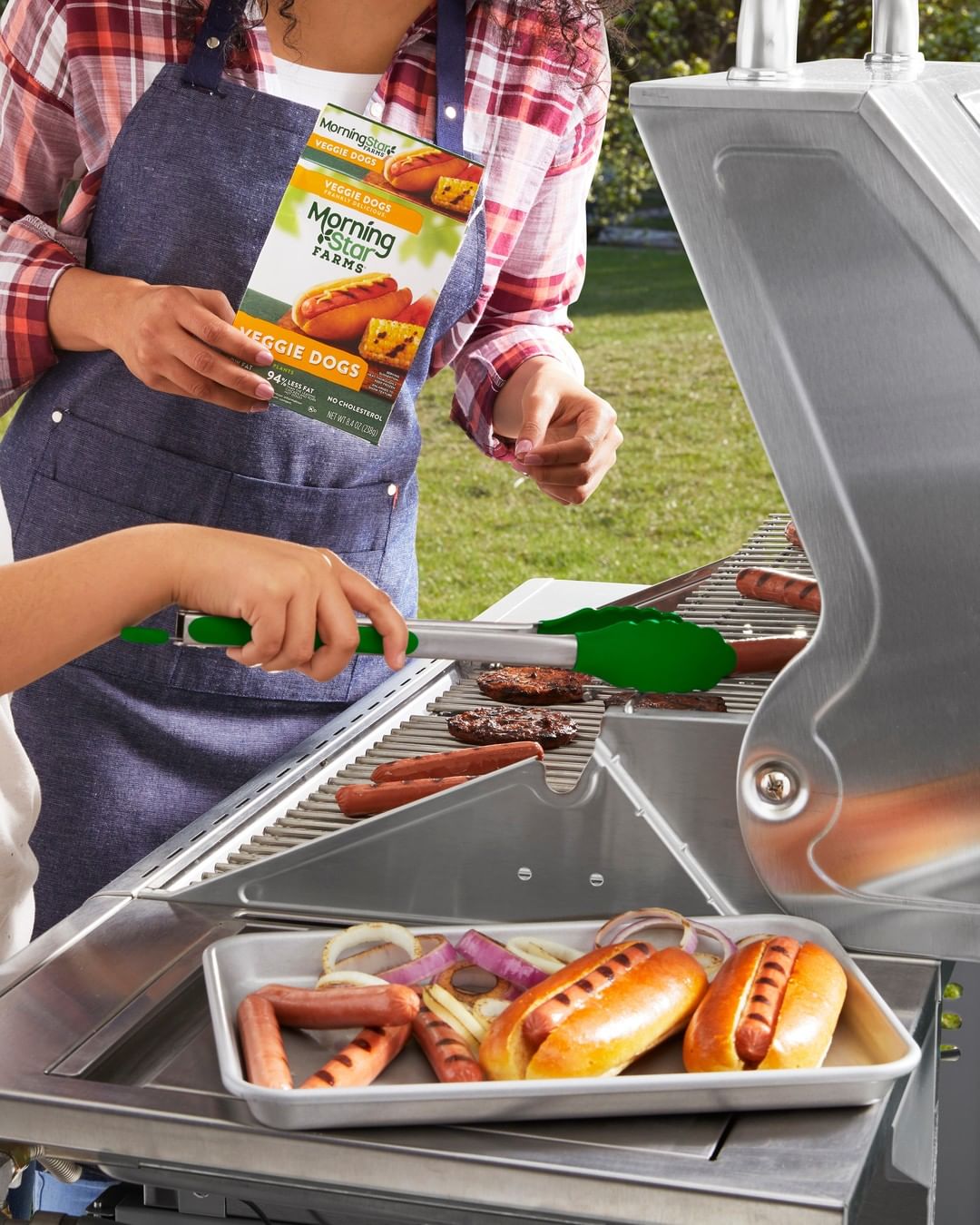
Take MorningStar Farms—a category captain and early bloomer in the meat-alternatives category, having been launched in 1975. Even with widespread distribution and a cult following amassed over more than four decades, the brand struggled to keep up with the onslaught of shiny, new contenders.
“I joined the team in early 2019, when the business had been in decline for at least six months. We conducted a deep-dive assessment of all our marketing levers, and we felt MorningStar Farms’ design system hadn’t kept pace with our competitors. We didn’t look modern, and the brand—which usually takes up one to two freezer doors—was difficult for consumers to navigate. We needed to bring back some of our cultural relevance and make the brand easier for consumers to shop,” said Heidi Ray, marketing director at Kellogg’s.
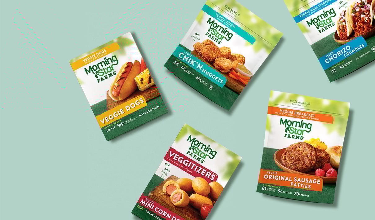
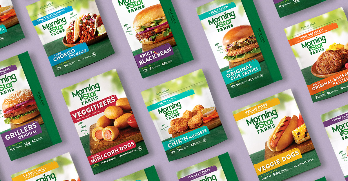
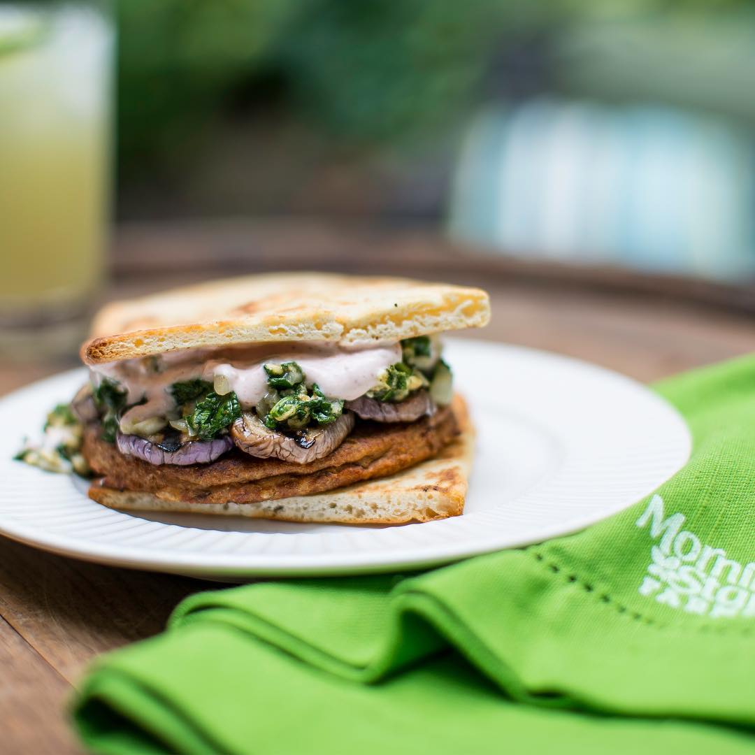
MorningStar Farms' portfolio is vast, encompassing dozens of products from Spicy Black Bean Burgers to Veggie Italian Sausage Crumbles to Zesty Ranch Chik’n Nuggets. Typically, consumers spend little time scanning store shelves for new products—a fact that’s doubly true in the freezer aisle.
“One of the big opportunities for MorningStar Farms was to encourage current buyers to purchase more products. Most consumers don’t realize there’s so much variety. When you show them the entire line, they invariably say, ‘Wow! I never realized there were so many products available,’” said Amy Brusselback, principal at Design B&B, the Chicago-based creative agency who led MorningStar Farms’ redesign effort.
"Most consumers don’t realize there’s so much variety. When you show them the entire line, they invariably say, ‘Wow! I never realized there were so many products available.'"
Given the incorporation of plant-based meat on the menus of mainstream restaurants and the flavor-focused marketing efforts of its competitors, MorningStar Farms also wanted to increase its taste appeal. “We wanted to acknowledge the advent of Instagram and its impact on food photography, and what that means for on-pack imagery. For this category, the number one anxiety point for consumers is, ‘What’s this going to taste like?’ Our highest priority is to drive taste appeal. MorningStar Farms has the highest rate of repeat in the category—so driving that first purchase is key,” explained Ray.
When any brand—particularly a well-established one—embarks on a redesign initiative, one of the first tasks is to understand which elements of the current design are meaningful to consumers and well-liked. Surprisingly, consumer research revealed that MorningStar Farms had few distinctive assets requiring protection: “There were a lot of nostalgic and personal associations with the brand, like ‘The spicy black bean burger was my first introduction to vegetarian eating’ or ‘My kids love the chicken nuggets.’ The brand just felt a little old-fashioned from a visual perspective, and it lacked strong visual equities. Consumers knew it was green, but that was about it,” recalled Brusselback.
Given this initial feedback, the first round of creative exploration was far-reaching—too much so, in fact. “We must’ve created 20 very differentiated design routes at the very beginning, and took a few of those into consumer testing. For example, one direction really leaned into creating a farm for MorningStar Farms—more natural and rustic looking. Consumers told us, ‘I love this, but it’s not right for MorningStar Farms.’ Another direction was reminiscent of what you’d see in quick-serve restaurants, with extremely bold typography and photography—very in your face. From this initial round of research, we learned we needed something closer-into the existing brand,” said Brusselback.
The team ultimately settled on a direction that emphasized the best of the existing brand: familiar American taste profiles and a friendly, backyard-barbecue feel. While the new design route might be considered evolutionary rather than revolutionary, the changes made were high-impact.
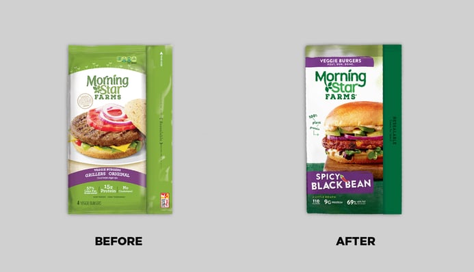
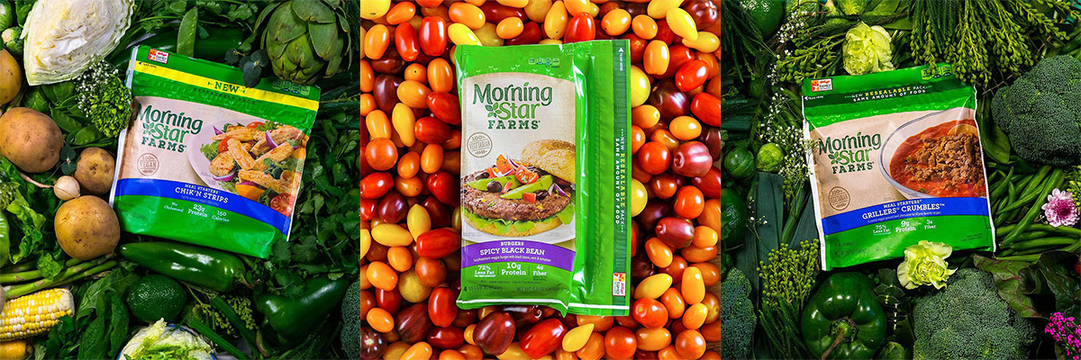
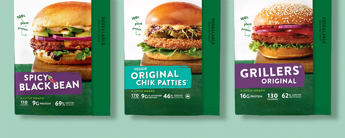
Perhaps the most striking feature of the updated design is the punched-up product photography, which was painstakingly art-directed. "The new photography is very taste-forward, starting with the fact that it's just larger-scale on the package. A lot of attention was given to what the garnishes would be and what accompanied the food so that we were creating a totally delicious experience, not just selling a burger patty. These details also helped to differentiate the varieties—to signal that the Chicken Patties are different from the Spicy Black Bean Burgers, for example,” said Brusselback.
The agency team jokingly confessed that the photographic process was equal parts art and science, complete with bun measurements and garnish trackers. “We literally had a spreadsheet of garnishes and types of bread, so we could make sure we had a good variety and that we weren’t over-using any ingredients,” recalled Brusselback.
Following current packaging trends, the new photography abandoned neat, idealized depictions of food in favor of more realistic imagery. “It’s got to be perfectly imperfect—under control and not sloppy, but it still needs to have a sense of humanity to it,” said Parker Sheley, art director at Design B&B.
While the updated photography helped to differentiate products in the MorningStar Farms family, changes to the hierarchy of communication took this effort even further. Flavor and product format descriptors—such as “Tomato Basil & Pizza Burgers” and “Veggie Corn Dogs”—were scaled up, with more emphasis being placed on important words.
Additionally, the agency worked to declutter the package so that consumers could focus more
on product varieties. “Over the years, we had started to ‘NASCAR’ the pack—over-claiming it and putting too many banners and call-outs, which was impacting shopability. With the new design, we really tried to carve out this area for claims at the bottom and stick with that,” explained Neil Cowan, brand design director at Kellogg’s.
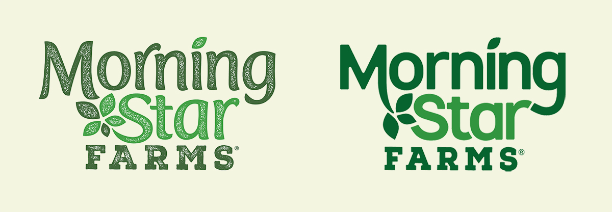
Upon first glance, one of the most striking changes to the packaging is the use of a dark green background. While the lighter-green coloring was one of the only distinctive brand assets identified by consumers in the pre-design research, the team felt that the specific shade of green could evolve without much risk.
“We wanted to maintain the green, but we moved from a fairly artificial shade into more of a natural space—less acidic and manufactured. The darker green also allowed the food photography to come to the forefront,” remarked Brusselback.
Additionally, the logo underwent some subtle changes to boost perceptions of modernity and
gender-neutrality; the texture was removed, and the typography became more geometric, with less-dramatic curves and reduced contrast between the thin and thick strokes of the letters—details that tend to make letters feel more ornate and “feminine.”
“Historically, the category had been fairly delicate and crafty; that was how brands signaled that they were healthy and plant-based. In design terms, you could say it was migrating from a very feminine category into a more masculine or gender-neutral one,” said Brusselback.
“We removed some of the fussiness. Now the logo is a little bit more assertive, bold, confident. That's what you're seeing come back from one of the original category players,” added Cowan.
When the creative development was concluded, the team felt so confident in the new design direction that they bypassed final validation testing—often considered a “must-do” when an established brand makes a significant design change. Brusselback emphasized the importance of conducting design research early in the process: “Kellogg’s leadership is commendable for their ability to say, ‘Look—we gathered all the consumer insight we need already, and we’ve made strategic decisions along the way. Let’s do this.’”
Retail sales grew 14% in the six months following the redesign compared to the same period during the prior year, representing an annualized impact of nearly $6 million.
MorningStar Farms’ new packaging launched to market in early 2020, eliciting an overwhelmingly positive response from plant-based buyers; They preferred the new design to the old by a three-to-one margin, according to Designalytics’ evaluation. Retail sales grew 14% in the six months following the redesign compared to the same period during the prior year, representing an annualized impact of nearly $6 million.1
“The packaging is your most tangible asset, and your most powerful marketing tool. It’s the thing that gets the most eyeballs. The role design played as the beacon for the refresh and resurgence of this business cannot be overstated,” said Ray.
MorningStar Farms underscores the way in which design can bolster all other marketing efforts; The brand insists that its design agency and its advertising agency work in lock-step to ensure brand consistency across channels—an extremely uncommon arrangement in the industry. “We partner with Weber Shandwick in a way that’s very unusual—we’re insanely, constantly in contact with them outside of meetings that the client directs. As a result, the brand is getting a lot more marketing bang for its buck because everything is creating the same experience for the consumer,” said Brusselback.
The packaging is your most tangible asset, and your most powerful marketing tool... The role design played as the beacon for the refresh and resurgence of this business cannot be overstated.
When asked to reflect on what made this initiative so successful, the brand team cited clear communication and alignment between its agencies, as well the importance of making objective design decisions. “In the first phase, we learned that we went too far in our design exploration, and we had to pull back. Respecting brand equities and understanding the degree of change required—despite personal opinions—was really crucial,” reflected Cowan, who has worked on many redesigns in his career.
Brusselback similarly emphasized the importance of respecting existing brand equities, particularly when working on large, well-established brands. “You can push on certain attributes as long as you keep the codes and cues that help shoppers get back to their previous purchases. We really think that the reason a brand originally became successful is part and parcel to what will keep it healthy forever—in the case of MorningStar Farms, that’s tasty, familiar flavors and easy-to-prepare, healthy meat alternatives.” She summed up this precept, saying “The fruit is in the roots”—an apt mantra for a long-enduring brand of plant-based provisions.
Download the report with interviews from all the Designalytics Effectiveness Award winners.
1 Nielsen xAOC, latest 26 weeks ending 8/1/2020 vs. the same period in 2019. Data impacted by Covid-19 has been adjusted to account for anomalous shopping trends that skew year-over-year comparisons. Category sales for plant-based meat increased during the pandemic—an outcome that has been minimized in this analysis to yield a more equitable comparison.


