New data revealing a correlation between air pollution and death from the coronavirus means that California's San Joaquin Valley which includes Fresno and Bakersfield may be at particular risk. The Harvard University study shows that higher levels of particulate matter in the air known as "PM2.5" correspond with higher rates of death for people who become infected with COVID-19.
Using a public database that shows the levels of particulate matter emissions in California, the Othering & Belonging Institute created a new layer to our interactive map that pinpoints areas that may be most susceptible in our state to suffer such a fate. The areas with the highest levels of PM2.5 were found to be the counties of Kern and Kings in the southern part of the Central Valley.
While those two counties show the highest overall pollution rates, each county in the state has its own high risk areas (Click here to see the results aggregated by tract).
The New York Times has reported on the Harvard study and generated a data set to show impacted regions. But our maps improve on that data set by taking into account population-weighted averages for each tract, as supposed to simply aggregating zip codes.
Our map also allows users to select a number of metrics to overlay each county. Users can choose to see the number of coronavirus cases (both per capita and in real terms) for each county, the number of deaths, the number of hospital beds, and other data that help tell a story unique to each region.
The findings of the Harvard study combined with our interactive map are useful for our state and local governments as well as aid groups in determining where to focus their resources and efforts in responding to the pandemic.
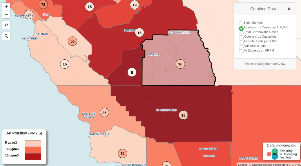
An image grab from our interactive map shows air pollution levels for the southern Central Valley with the number of coronavirus cases indicated over each county. Click for the interactive version.

